Directus APP uses Vue 3, TypeScript, built with Vite. This article records front-end related knowledge learned during the evaluation of the Directus APP.
1. Vite
Build tool, similar to webpack.
1.1. Principle
Uses the browser’s ES6 module loading function, so front-end can load JS modules on demand. During development, bundling is not needed.
<script type="module" src="./foo.js"></script>
The above module-type loaded foo.js can also import other modules and export. Browsers recognize import and export commands in JS and will send requests to the backend to load on demand.
1.2. Application
Configure dev server in vite.config.ts, for example, listening on port 8080, with API requests sent to port 8055.
	server: {
		port: 8080,
		proxy: {
			'^/(?!admin)': {
				target: process.env.API_URL ? process.env.API_URL : 'http://localhost:8055/',
				changeOrigin: true,
			},
		},
		fs: {
			allow: [searchForWorkspaceRoot(process.cwd()), '/admin/'],
		},
	},
2. Vue
A way to organize JS/CSS/HTML. The runtime environment (JS library) provides data binding, changing state updates the display, making it easy for JS to update pages.
2.1. Basic Concepts
- data: A function that returns the component instance’s data object.
- props: An array or object. These are configurable parameters when the parent component calls this component.
Both data and props can be accessed in the template. The difference is:
- data is not passed from the parent component; it’s private to the child component and is readable and writable.
- Data in props is all passed from parent to child and is read-only.
data stores component state; components without data are stateless components.
- mixin: To be DRY (Don’t Repeat Yourself) and reduce duplication, extract common parts of component scripts (data, props, methods, etc.) into a separate object. Then mix it into the component.
- setup function: Used to replace mixin, implementing Composition API. Its input is props and context, and output is an object. All properties of that object can be accessed in the component.
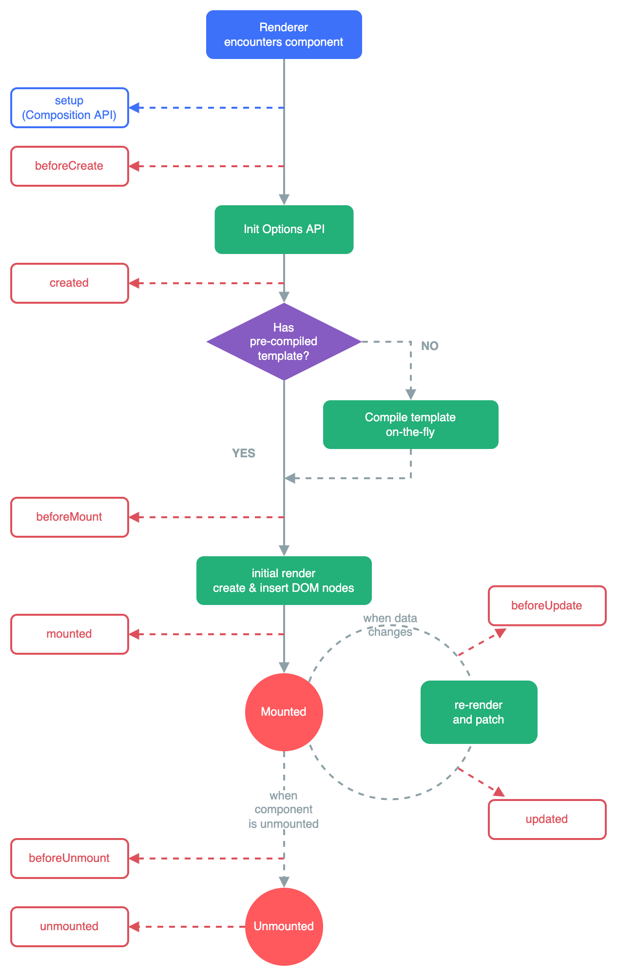
2.2. Component Lifecycle
3. HTML
3.1. data- Custom Attributes
In HTML generated by Vue, you see many divs with data-v-xxxx attributes. These are produced by scoped CSS. The same component generates the same data-v value.
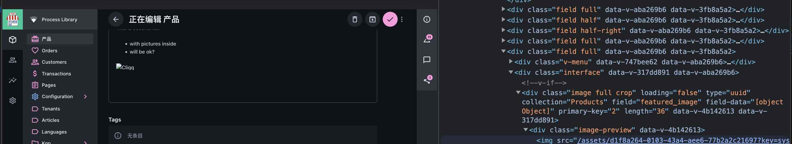
The data-* attribute adds custom information to a <div> element. The * part is replaced with a lowercase string, such as data-id, data-source, data-category, etc. A <div> element can have any number of data-* attributes, each with their own name.
<div id='strawberry-plant' data-fruit='12'></div>

<script>
// 'Getting' data-attributes using getAttribute
var plant = document.getElementById('strawberry-plant');
var fruitCount = plant.getAttribute('data-fruit'); // fruitCount = '12'

// 'Setting' data-attributes using setAttribute
plant.setAttribute('data-fruit','7'); // Pesky birds
</script>
This custom attribute is defined in the HTML5 standard and can be accessed in JS.
4. CSS
4.1. Basic Concepts
Basic format is:
p {
  font-family: verdana;
  font-size: 20px;
}
Where p is the selector, and the following braces contain a list of properties and values.
Selectors select HTML elements based on certain rules. Basic ones include:
- All elements: asterisk
- Tag names: body, a, p, h2…
- Class: dot
- ID: hash
Some combinations:
- Multiple element selector: E, F - multiple selectors separated by commas
- Descendant selector: E F - matches all F selectors inside selector E. For example,
.box h2- all h2 inside elements with class box - Child selector: E > F - difference from above is it only matches direct children. Only matches one level. Descendants match multiple levels.
- Adjacent sibling selector: E + F - E and F are siblings and are adjacent; then match F.
Attribute selector: Uses brackets, selects based on element attribute name/value.
Inheritance: Styles on outer elements are automatically inherited by inner elements. If inner element styles conflict with outer, the inner takes effect.
Positioning:
- fixed: Fixed, relative to browser window position. Followed by coordinates. Doesn’t take up standard document flow space, covers standard document flow.
- relative: Relative, relative to original position
- absolute: Absolute, coordinates are relative to positioned ancestor elements. If no ancestor is positioned, it’s the same as fixed. Doesn’t take up standard document flow space, covers standard document flow.
4.2. SCSS
A new version of Sass, a language that generates CSS. Similar to CSS3, adding variables, inheritance, etc. Convenient for generating CSS.
See https://www.jianshu.com/p/6bb174c79172 The ampersand (&) symbol is the parent element selector.
4.3. Application in Directus
Below is the CSS for the left navigation bar on the main screen. On mobile screens, it’s not displayed by default; only clicking the top-left menu shows it. On PC, there’s no menu button, so it’s displayed by default. Looking at the implementation, the leftmost control moves 100% to the left to leave the screen, achieving hiding. The rightmost does the same, moving 100% to the right to hide.
#navigation {
    position: fixed;
    top: 0;
    left: 0;
    z-index: 50;
    display: flex;
    height: 100%;
    font-size: 0;
    transform: translateX(-100%);   //Hidden by default
    transition: transform var(--slow) var(--transition);

    &.is-open {
        transform: translateX(0);   //Shown
    }

    &:not(.is-open) {
        .module-nav-resize-handle {
            display: none;
        }
    }

    .module-nav {
        position: relative;
        display: inline-block;
        width: 220px;
        height: 100%;
        font-size: 1rem;
        background-color: var(--background-normal);

        &-content {
            --v-list-item-background-color-hover: var(--background-normal-alt);
            --v-list-item-background-color-active: var(--background-normal-alt);

            height: calc(100% - 64px);
            overflow-x: hidden;
            overflow-y: auto;
        }
    }

    .module-nav-resize-handle {
        position: absolute;
        top: 0;
        right: -2px;
        bottom: 0;
        width: 4px;
        background-color: var(--primary);
        cursor: ew-resize;
        opacity: 0;
        transition: opacity var(--fast) var(--transition);
        transition-delay: 0;
        user-select: none;
        touch-action: none;

        &:hover,
        &:active {
            opacity: 1;
        }

        &.active {
            transition-delay: var(--slow);
        }
    }

    @media (min-width: 960px) {
        position: relative;
        transform: none;    //Shows when greater than 960px

        &:not(.is-open) {
            .module-nav-resize-handle {
                display: block;
            }
        }
    }
}